Thank you for being part of my workshop
Here are my workshop notes for your future reference.
I’ve just launched this brand new website, and I couldn’t be happier with it— come and have a look


Grounds
I tend to work on 3mm ply panels. I buy 3mm ply from Bunnings in sheetys. The large-sized sheet is the best value at 120x240cm. They also sell sheets 120x80cm. Too big for most cars, so get the guys in the woodshed to cut it in two for you. This ply can be cut with a Stanley knife. I usually get it cut into the sizes I require in the Bunnings shed. Give them a diagram of the sizes; it makes it much easier to explain. The ply is made into panels at home. I buy pine lengths (Bunnings) for the cradle. You will find instructions on YouTube for making panels. If I can do it, you can.
I buy “Spring” brand flat white paint, $18 for 4 litres, to prep my ply. 3 coats of paint, let each coat dry thoroughly. I sometimes work on a coloured ground, I gesso my panel and once dry will paint it one colour in acrylic.
Drawing on
I work from direct observation or from drawings I have made on location. I draw my image directly onto the painting surface. I use a round brush and usually acrylic ink. I will use paint thinned with medium if I don’t have ink available. Regular ink will reconstitute so make sure you use acrylic ink.
Colour
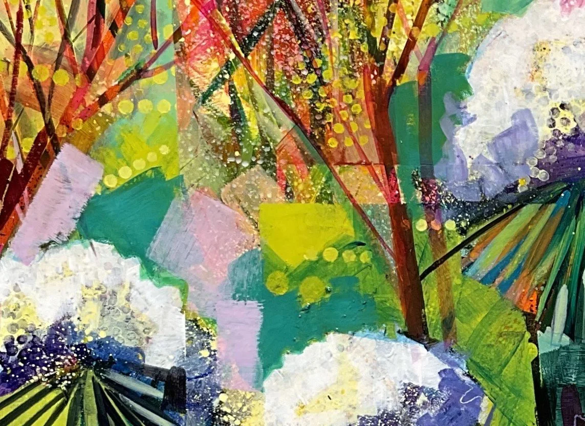
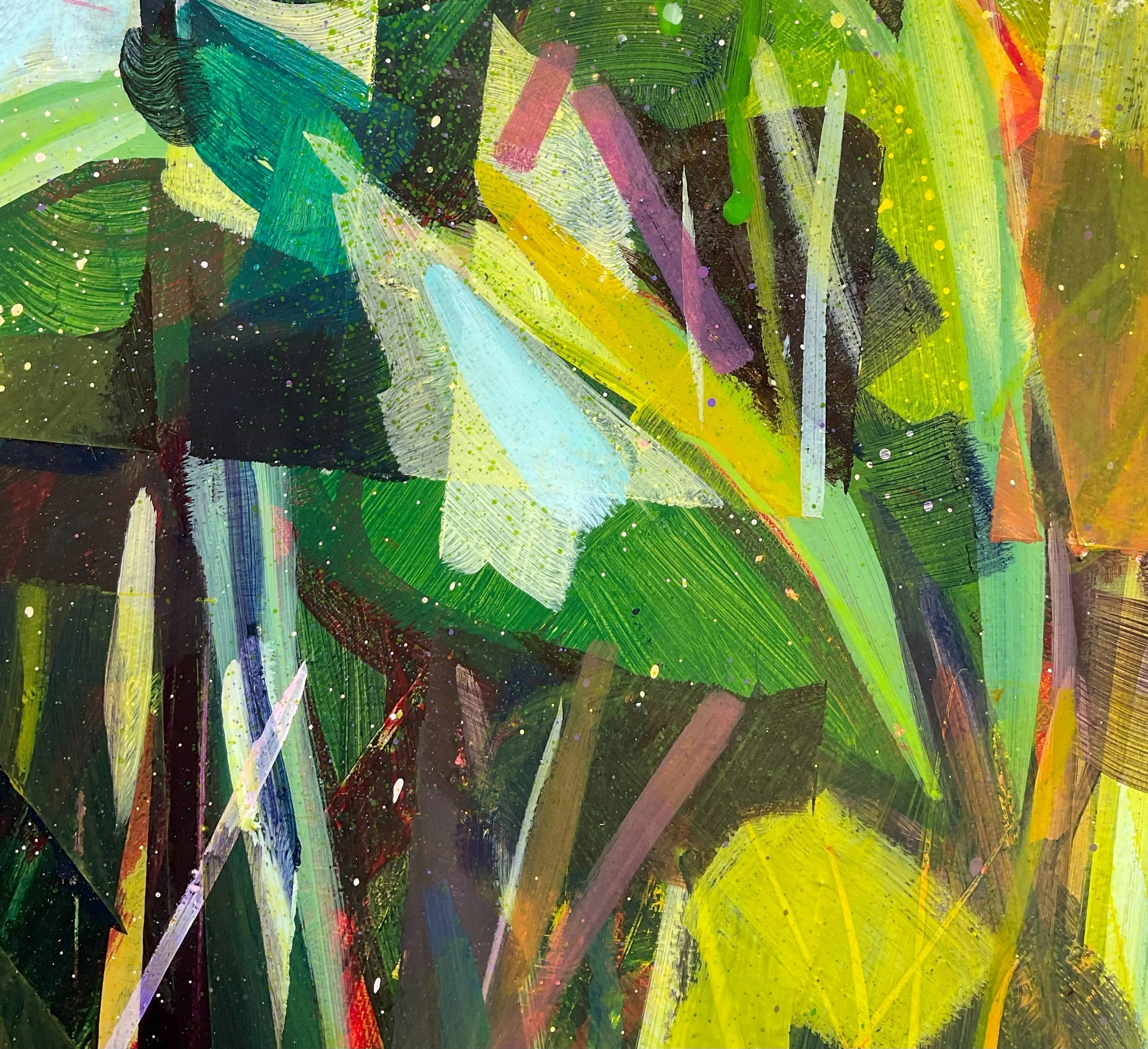
I use a limited palette, only 8 colours of paint, in most of my paintings. By mixing, you can create hundreds of beautiful colours, which are uniquely beautiful.
There are 2 sets of primary colours, warm and cool. They are warm or cool relative to one another. Cadmium red is warmer than alizarin crimson because it is nearer orange/ yellow on the spectrum. Warm yellow (cad. yellow) is closer to orange/red than lemon yellow on the spectrum. There is some dispute over the blue. I believe that Ultramarine is warmer than Phthalo blue because it is nearer to violet / red than Phthalo, which is closer to green/yellow. For my teaching, I treat ultramarine as a warm blue. In the workshop, we only used one set of primaries (cool).
Primary colours are red, yellow and blue. You cannot mix a fully saturated primary colour.
Cool Primary Red = Alizarin Crimson, Blue = Phthalo Blue, Yellow = Lemon Yellow
Warm Primary Red= Cadmium red, Blue= Ultramarine, Yellow= Cadmium yellow
Plus, white and burnt umber.
Please note that some brands have alternate names for the colours;warm red seems to be the worst for this.
Secondary colours are colours which combine two primary colours
Orange = red + yellow
Violet = red + blue (for a clear violet use cool red)
Green = yellow + blue (for a clear green use cool yellow and cool blue)
There is no set quantity of either primary to make a true secondary. You must judge by eye.
Please note that when mixing orange or green, start with yellow and add the blue or red. Yellow is of a lesser value than red or blue and is overwhelmed by the other primary.
Value is how light or dark a colour is. Value ranges from almost black to almost white, usually in 9 steps.This is a value scale.
Tertiary colours are in between the secondary and the primary. There are many tertiary colours; you can mix a full range between each primary and secondary. If you wish to get very yellow greens, then mix a green and add that to the yellow. It is very difficult to achieve subtlety by mixing blue into yellow, as the blue turns the yellow green very quickly. The same happens with orangey yellows, which are nearer yellow. Mix an orange and add that to the yellow rather than the straight red.
Complementary colours
Complementary colours are colours which are opposite each other on the colour wheel/ triangle. These colours make each other look brighter if used fully saturated and next to one another. Blue is the complementary of orange. Yellow of violet, Red of green
Use of black
I don’t use black paint. Many books teach you to make shades (darker colours) by adding black. Black makes colour duller and harsher. I make a chroma dark: cool red, cool blue and burnt umber. Chroma means it is mixed with colour. Black is not a colour.
Saturated/ desaturated
Saturation refers to the purity of colour. Colour can sometimes be called hue. Desaturated colour is a less bright, muted or less pure version of a saturated colour. There are several ways to make a desaturated colour.
Mix in its complementary. You can mix a full range of desaturated colours by adding increasing quantities of their complementary
Mix in a dark. You can mix shades, which are also desaturated colours, by adding either burnt umber or a chroma dark. This dark can be adjusted to be bluer, redder, more violet or browner. You can mix a huge range of shades of each colour.
Mix in white. When you add white to a saturated colour, you make tints. You can mix a huge range from very light to almost full saturation.
Mix in the three primaries as a chroma “dirt”.
Mixing grey.
To make grey, combine all the primary colours. The primaries cancel each other out. The “dirt” you get is called chroma dark. Add white to make grey. Adjust your grey by adding more of any primary. If the grey favours a colour too much, then add its complementary colour. If it is too pink, add green; too orange, add blue; too violet, add yellow. Next time you are in Bunnings check out the paint samples of greys and compare them in natural light.
You can add grey to a fully saturated colour to desaturate it.
Glaze
A glaze is a thin, translucent paint. You make glazes by adding more medium or glazing medium to your paint. This thins the paint into what is referred to in watercolour as a wash. The more medium, the thinner, less saturated, and more translucent the glaze. Glazes can be used in various ways. You can cover the entire piece with a coloured glaze to unify/ harmonise a painting. Mix paint with glazing medium in early layers, especially if you will be using some reductive techniques.
Harmonising colour
If a painting is harmonised, it will read better. Harmonising pulls a piece together and softens it and when working with backgrounds, it will send it background. There are several ways to do this.
You can mix a “mother” colour, usually a combination of the primaries or the colours you are using, add a little of this to each of the colours, and the painting will be harmonised. Each of the colours will also be desaturated.
You can paint the whole piece with an isolation coat of clear medium, which has had a colour added to it. You can add as little or as much colour as you like.
Relativity
Colour is relative to the colour right next to it. There are many colour exercises which demonstrate this. Colour is relative to the colour right next to it; colour is rarely viewed in isolation. You will find many colour exercises which demonstrate this idea on YouTube or Pinterest. Blue looks quite different next to orange than it does next to green. The saturation of the colours also affects the way colour looks when placed next to one another. Colour is also subject to cultural and personal bias and perception.
Brief Glossary of Colour Terms
Analogous colours are colours adjacent to one another on the colour wheel
Warm colours are red, yellow and orange
Cool colours are blue, violet and green
Hue is another word for pure colour
Saturated colour is pure colour
Desaturated is a muted colour
Pristmatic is another term for fully saturated colour
Complementary colours are a primary and it’s secondary.
Tertiary colours are primary colours mixed with their secondary. There are many tertiary colours.
Chroma grey is grey mixed from colours. The primary colours cancel each other out to make a neutral
Trichromatic colours are cyan, magenta and yellow. They are used in commercial printing with black.
Visual mix colours which are laid over one another thinly to make a third colour. For example, a thin coat of blue over yellow will make green
Actual/physical mix mixing colours to make a third colour
Colour mixing
Paint must be mixed thoroughly. Streaky paint looks lazy, not arty. If you are using a flat brush, make sure you turn it over so both sides are mixing. Mix paint with a medium, not water and be kind to your brushes.
Binder
Use a binder, either gloss, matte or binder or glazing medium, to mix paint. Water is for washing brushes. Binder helps acrylic keep its sheen and gives it viscosity. Please note that mediums can have a variety of names. It can be called flow medium or similar.
Finishing
I use gloss medium to seal my finished paintings. When I seal a painting, it must be completely dry, I apply sealer on dry days. If it is raining, it is better to wait out the weather. Apply gloss in one direction with a large brush. I keep a large flat taklon brush for this purpose. Make sure the surface is clean, no dust, or stray dog hair (it happens). If you find the medium is pooling or separating, then you are putting too much on. I apply 3 coats with 24 hours between coats. Never allow to dry in the sun. Let it dry in a ventilated room naturally.
Applying gloss brings out the sheen and layers in the paint. If you feel it is too shiny, you can use a cold wax finish on top of the dry gloss. I apply a thin layer of wax to achieve a satin finish. I apply it with a soft cloth, usually a clean t-shirt rag. Cold wax is ideal, but expensive. I use a blend of coconut oil and beeswax, which I make at home.
Isolation coat
Acrylic is designed to be applied in thin layers. It is meant to be semi-translucent. If you would like a thick, impasto look, then use gel or impasto medium. Beginners find the “ streaky” look of acrylic challenging at first. You build colour with layers. Trying to get a flat matte look with one coat will only end in tears, sometimes real ones. Let the paint do what it does well.
After 5 or 6 layers, acrylic paint starts to sink. It actually disappears into the layer below. I am not sure why, but it does. You will need to apply an isolation coat to mitigate this. A clear coat of binder or gloss medium applied thinly seals the underlying layers. Apply in one direction and do not dry in the sun, ever. Your base layers are now fixed. An isolation coat can be tinted with any colour. This will help harmonise your work. Any paint applied on top of this coat will tend to come forward, especially if it contains white. Paint with white in it is more opaque and will come forward. If it is jumping out then use a glaze to knock it back. An ultramarine glaze works really well.
Water
Change your water frequently. Dirty water makes dirty colour. If it is a hassle, line up water containers to use. I use litre buckets for mine.
Brushes
I use synthetic taklon brushes. Make sure you change your brushes frequently. As soon as they start to spread at the bristle ends, it’s time for new brushes. Cheap shops sell Montmartre, and Officeworks has a good range of taklon brushes too. There are some fabulous ones with silver handles. Never leave your brush out with paint on it. Acrylic dries and ruins brushes. I wash my brushes using shampoo or hand soap, then thoroughly rinse them in clean water. Always leave them standing bristles up. Never leave them for too long in water, as the bristles will be left bent.
Rags
Use a rag or cloth to take excess paint off your brush before washing it. Use a cloth to dry your brush before mixing a new colour so that the paint isn’t watery. Old t-shirts make the best painting rags.
Wet Palette
I use a wet palette, it is really helpful in the Queensland climate. Buy a large plastic tray from a dollar store. Line with a shop towel, old rags, a kitchen towel or a chux. Pour in water. Pour off excess water. Then line with baking paper. When baking paper is covered with paint, dispose of it. Add new paper. If you have colour remaining you wish to use, cover the palette with cling film until next time. Scrapbooking boxes from Kmart are also good and can be closed up at the end of a session to preserve paint. The large flat lidded boxes are best.
Tools
I use many tools for making my paintings in addition to my brushes.
Masking tape and washi tape. Isolate areas you like or use to break up a static image. To make a sharp shape amongst a lot of texture.
Stylus, sticks, nails, drill bits, dental tools, scrapbooking tools – all great for sgraffito (scratching)
Nit combs, tilers’ scrapers, play-dough tools.
Paint scrapers, squeegees, credit cards and straight edges for scraping and use for clean edges or drawing precise straight lines.
Kitchen spatulas - moving paint around.
Stamps – homemade from craft foam, gel medium, card and scrapbooking jewels. Or carve a rubber or linocut block.
Bubble wrap – for printing
Rollers – applying paint and printing.
Stencils – homemade from craft paper or laminated paper, or purchase pre-made from Bunnings, Kaiser Kraft, or Kmart. Remember, the shape you cut out of stencils also makes negative shapes, which you can use as a stencil. Use stencils to apply a pattern, turn over and print reverse. Use baking paper to rub the stencils when printing in reverse. Use a baby wipe and stencils to rub paint away. Use a stencil brush for a cleaner result.
Spray paint works well with stencils
Old brushes – make great “drag marks “through wet paint.
Sandpaper: to remove dry paint, but also to press into wet paint for a reductive speckle
Pippettes
Spray bottles
Oil pastels and crayons for resist and marks on top
Posca pens – you can paint over Posca’s, so the marks don’t sit on top. Make sure your paint is dry when you use a Posca
Correction tape – remember you can glaze /paint over it, so it isn’t white or scrape the striaght edge with a blade.
Collage – make collage paper with leftover paint. Scrapbooking papers work if you paint over them, so the pattern isn’t as obvious.
Acrylic Ink – apply with a stick (draw), dropper, pippette, spray on, also leave a few minutes and rub off to leave ghost marks of ink. Use acrylic ink only. Use a pipette for dibble marks where you want them. You can also flick ink on with a brush. Use ink in areas where it won’t get on other work, or where you don’t mind it on walls and floors.
Water – spray on, leave a few minutes, then gently rub over with a baby wipe or clean cloth, or use a pipette for dribbled marks
Additive/ Reductive
When you apply paint with a brush, knife, etc, this is an additive technique; when you take paint away, this is a reductive technique. Combining the two makes for beautiful layers and marks which cannot be achieved any other way. If you are intending to use reductive techniques in your work, then always use a glazing medium, especially in the early layers. If you are using binder or gloss medium, don’t let the paint dry completely. You can take acrylic off with rubbing alcohol, but even that can be hard work if the paint has dried completely. If all else fails, use a rotary sander to take the piece back and reveal layers.
Suppliers
School Art Supplies – online with an ABN
Bunnings, Kmart, Officeworks, Kaiser Kraft
Subscribe to my website if you would like to hear from me occasionally throughout the year, and get first dibs on workshops, exhibitions and new work